Pistol
 CZ75-Auto
 Desert Eagle
 Dual Berettas
 Five-SeveN
 Glock-18
 P2000
P2000 P250
P250 R8 Revolver
 Tec-9
Tec-9 USP-S
USP-S Zeus x27
Knife
 Bayonet
 Bowie Knife
 Butterfly Knife
 Classic Knife
 Falchion Knife
 Flip Knife
 Gut Knife
 Huntsman Knife
 Karambit
 M9 Bayonet
 Navaja Knife
 Nomad Knife
 Paracord Knife
 Shadow Daggers
 Skeleton Knife
 Stiletto Knife
 Survival Knife
 Talon Knife
 Ursus Knife
 Kukri Knife
 AK-47
AK-47 AUG
AUG FAMAS
FAMAS Galil AR
 M4A1-S
 M4A4
M4A4 SG 553
 AWP
AWP G3SG1
G3SG1 SCAR-20
 SSG 08
 MAC-10
 MP5-SD
 MP7
MP7 MP9
MP9 P90
P90 PP-Bizon
 UMP-45
 MAG-7
MAG-7 Nova
Nova Sawed-Off
 XM1014
Machinegun
 M249
M249 Negev
NegevGlove
 Bloodhound Gloves
 Broken Fang Gloves
 Driver Gloves
 Hand Wraps
 Hydra Gloves
 Moto Gloves
 Specialist Gloves
 Sport Gloves
Categories
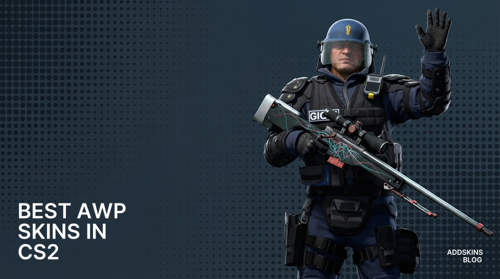
The AWP dictates round tempo and map control in CS2. One-shot headshots and instant body kills force teams to respect sightlines and adjust utility usage. Because the rifle appears in decisive moments - clutches, eco breaks, retakes - its visual identity carries weight beyond cosmetics. Players recognize opponents by their AWP skin before seeing the nametag. That recognition extends to streams, highlight clips, and inventory screenshots. Some match their AWP to sidearms like the P2000 for a cohesive loadout identity.
Competitive players evaluate skins by in-game contrast, scope readability, and finish behavior under map lighting. Wear levels, detail density, and how paint reads during flicks separate usable options from distracting ones. Pattern rarity matters to collectors, but practical players prioritize silhouette clarity, matte versus gloss trade-offs, and edge contrast. A skin that looks sharp in inventory but washes out under scope zoom or blends into Mirage palace shadows fails where it counts.
This selection emphasizes real-match performance: clear scope readability, coherent design across wear levels, and a range from budget to prestige. Each skin maintains silhouette definition at range, holds up during scope animations, and pairs cleanly with knives like the ★ Stiletto Knife. Market availability and collector demand were weighed against straightforward visibility. The goal is practical options that work in ranked matches, not just inventory showcases.

Dark veins over pale red create organic contrast without visual noise. Satin finish keeps glare low, and the stock's flat lacquer stays readable through scope. Works well for passive AWPers who hold angles - pattern doesn't distract during long holds. Pairs with warm-toned gloves and reads clearly on Dust2 and Mirage.

Charcoal with lighter marbled veins. Semi-matte finish kills reflections, making it ideal for players who hate scope glare. Low-profile design suits aggressive AWPers who peek often - nothing flashes or catches light mid-strafe. Underrated for dark map performance, blends into Inferno apartments and Overpass bathrooms without losing definition.

Layered green scales with white separators deliver high contrast on any map. Semi-gloss texture on barrel and scope shows detail without washing out. Popular with entry AWPers - pattern stays visible during quick peeks and retakes. Strong visual identity in clips and streams. Matches well with emerald or forest-themed knives.

Tan mesh over olive with repeating diamonds. Matte finish and neutral palette make it the quietest option here - blends into most maps without disappearing. Budget-friendly choice for players who want clean aesthetics without statement pieces. Works across all wear levels, Battle-Scarred still looks intentional, not worn.

Olive and yellow banding with scale accents. Satin finish catches light subtly, giving just enough pop without glare. Retains pattern clarity through scope and during strafing. Suits players who want visibility without loud colors - reads well on both bright and shadowed maps. Pairs cleanly with gold or bronze knives.

Gray base with darker blotches and linear scratches. Matte coating with sparse glossy flakes near joints. Low-contrast in shadows but identifiable at medium range - works for players who prioritize stealth over flash. Collector appeal is niche, but practical performance is solid. Fits tactical, no-nonsense loadouts.

Two-tone split with central dark stripe and light outer panels. Smooth semi-gloss lacquer with pronounced edge reflections. Clean geometric design reads instantly at any range - ideal for players who want immediate visual recognition. High mid-range readability makes it strong for holding long angles on Dust2 and Ancient.

Charcoal with pale bone motifs and linear accents. Semi-matte finish with worn edges at higher wear. High contrast on bright maps like Nuke and Vertigo - pattern stays defined when scoped. Popular among collectors for the skull theme, but practical players value the consistent readability across lighting conditions.

Olive drips over darker base with vertical highlights. Satin surface with reflective spots on raised panels. Vertical patterning stays clear during movement - suits aggressive AWPers who reposition frequently. Reads well on Inferno and Overpass. Pairs with green or camo-themed inventories without clashing.

Pale icy blue with fractured veins and frosted borders. Low-gloss finish with defined stock texture. Cool palette stands out on warm-toned maps like Mirage and Dust2. Underrated for visibility - blue contrasts sharply against sand and stone. Works for players who want a distinct look without loud colors or heavy patterns.
Pick skins that work in matches, not just inventory screenshots. Prioritize contrast, finish type, and scope readability over pattern rarity alone. Matte and satin finishes reduce glare during holds, high-contrast elements stay visible during flicks. Match your AWP to your playstyle - passive angle holders benefit from low-distraction designs, aggressive peekers need patterns that stay readable in motion. Coordinate with your knife and Pistol for a cohesive loadout. Test skins on your most-played maps before committing - lighting varies, and a skin that pops on Nuke might wash out on Inferno.
Skins with strong contrast and matte or satin finishes tend to read best, as they avoid glare and keep key details visible at range.
Choose paints that preserve silhouette and have balanced color blocking so the rifle stays readable through scope and in motion.
Match dominant tones and finish type, satin or matte knives pair smoothly with similar-finish rifles to avoid visual clash.
Gloss and chrome reflect more light and can pop on screenshots, but satin offers the best practical balance for matches.
High-contrast elements and lighter accents stay visible on dark maps, while muted or low-contrast patterns can blend into shadows.